
The ChallengeHow do you translate a wine region’s heritage into a brand system that feels both timeless and contemporary?
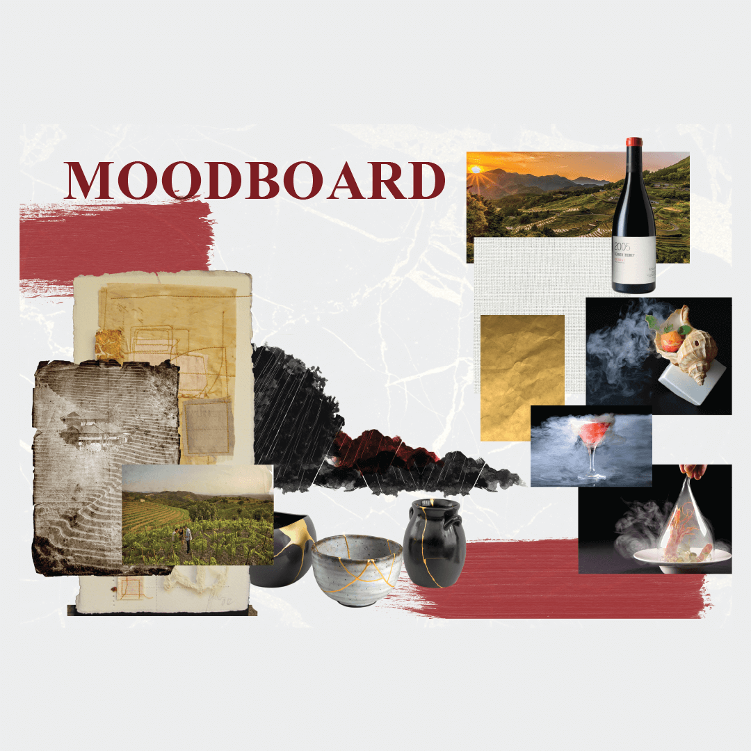
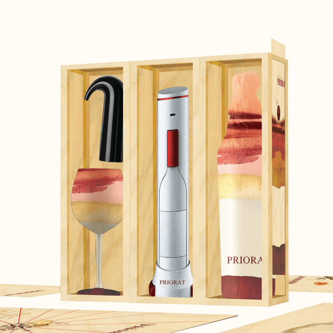
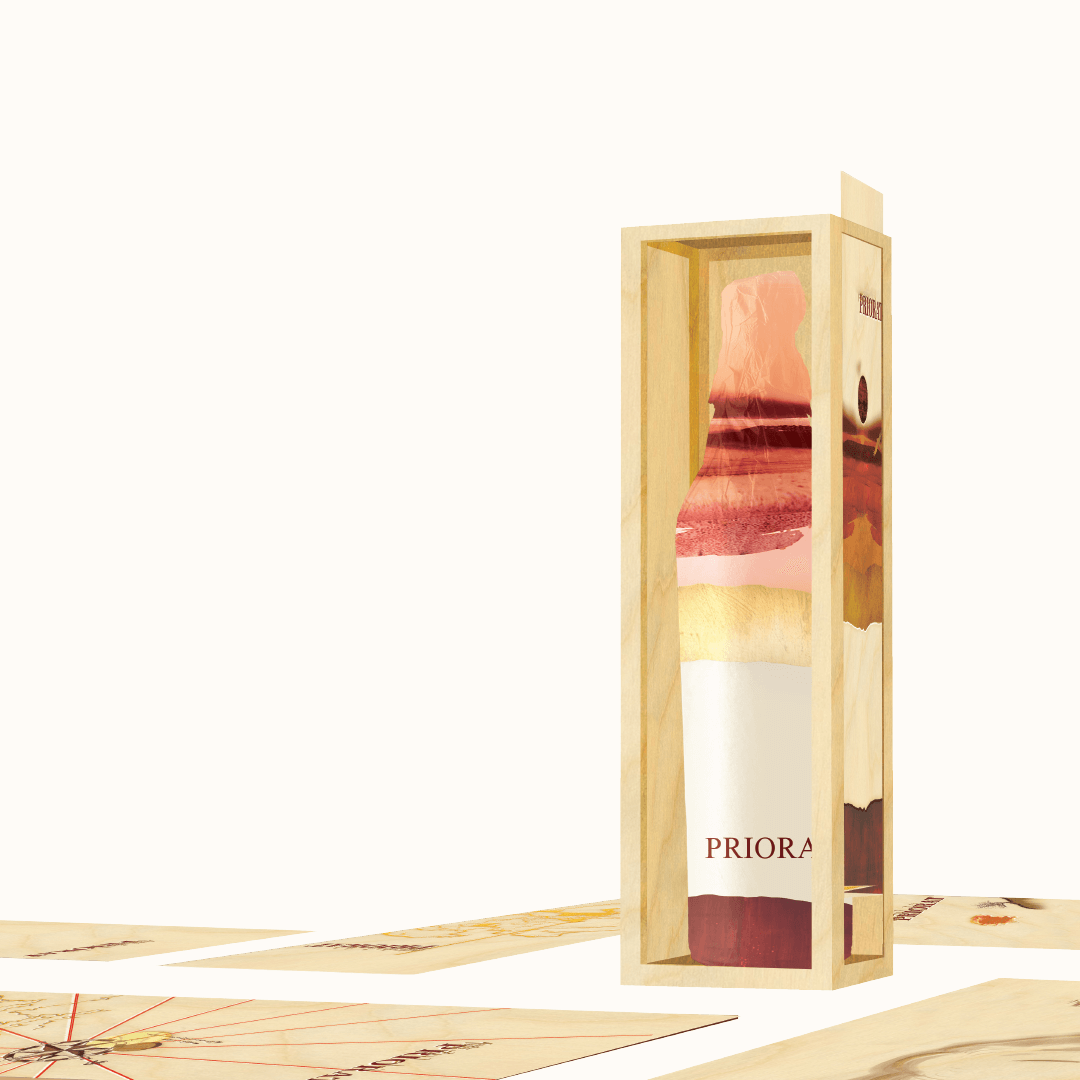
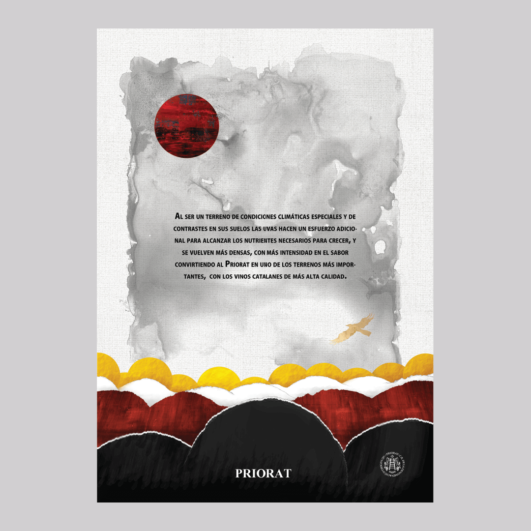
Priorat is one of Spain’s most prestigious wine regions, known for its rugged landscapes, centuries-old vineyards, and powerful reds. The challenge was to capture this raw authenticity and transform it into a cohesive visual language.
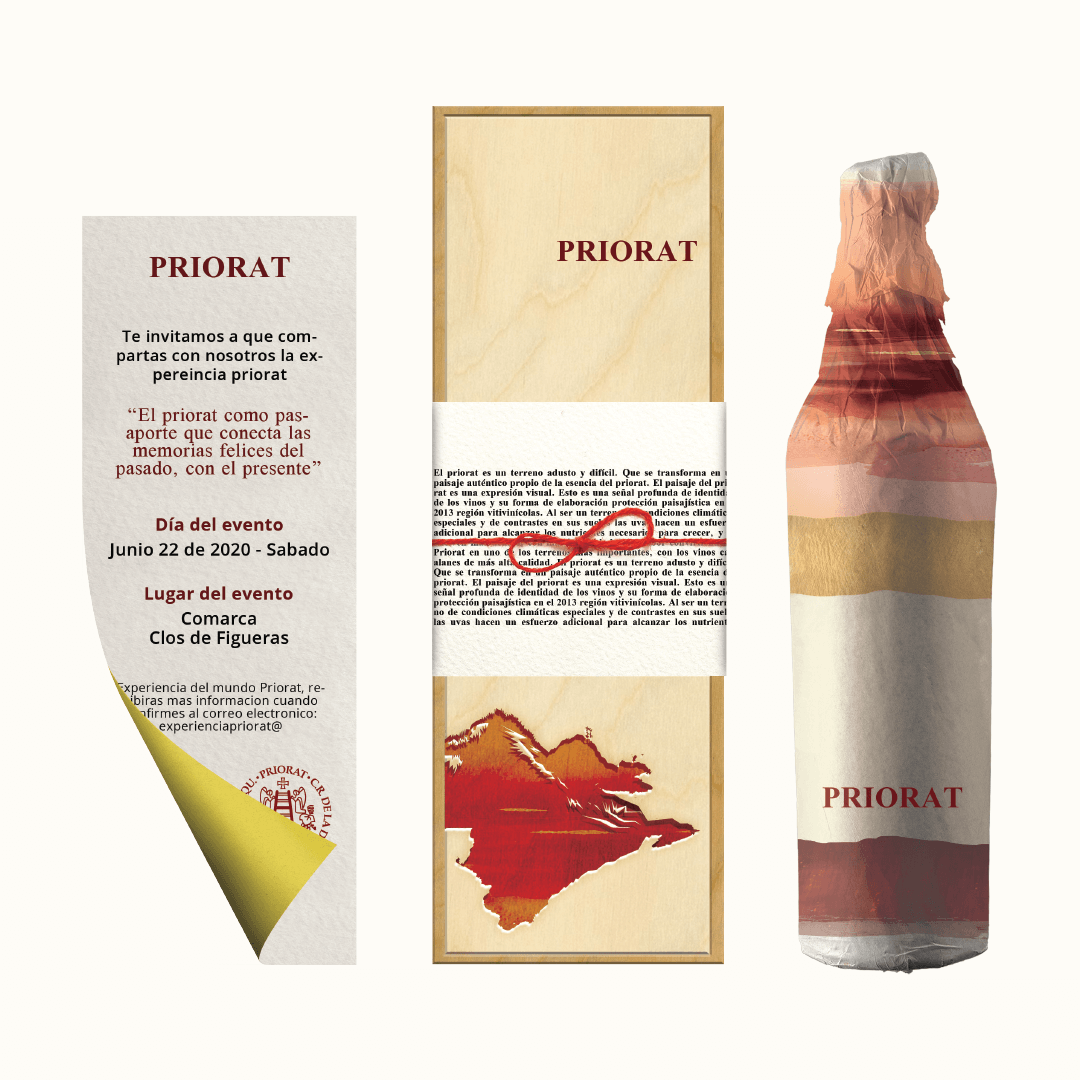
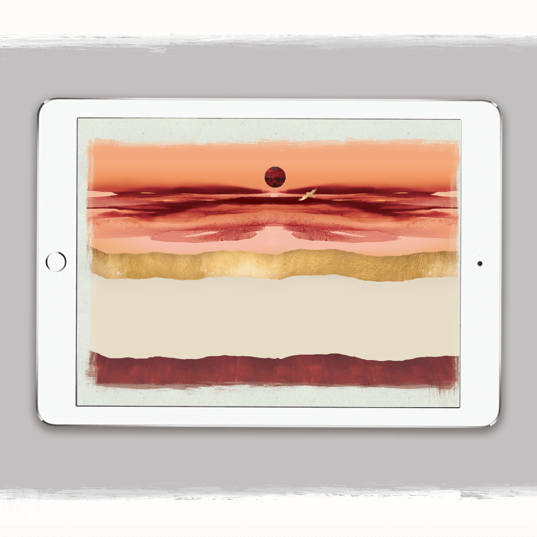
The OutcomeThe brand system was inspired by the contrasts of Priorat: strength and delicacy, tradition and modernity, earth and refinement.
Typography, textures, and color palettes were chosen to echo the stony soils, terraced hills, and deep character of the wines.
-
Serif typography and earthy tones to reflect heritage.
-
Minimalist labels paired with strong graphic elements.
-
Photography and layouts showcasing the raw terrain balanced with refined tasting notes.
Through these elements, the brand became not just a wine label but a portrait of the land itself.
The ConceptThe result was a brand that positions Priorat as both rooted in history and alive in the present.
By merging storytelling, visual identity, and product experience, the design elevates Priorat from a geographic origin into a living brand system where every detail connects wine lovers back to the soul of the region.


My Design Philosophy