
The ChallengeHow can visitors get in touch with me in a way that feels simple, professional, and welcoming?
Poor SEO visibility.
Outdated content and copywriting.
Design inconsistencies due to an evolving design system.
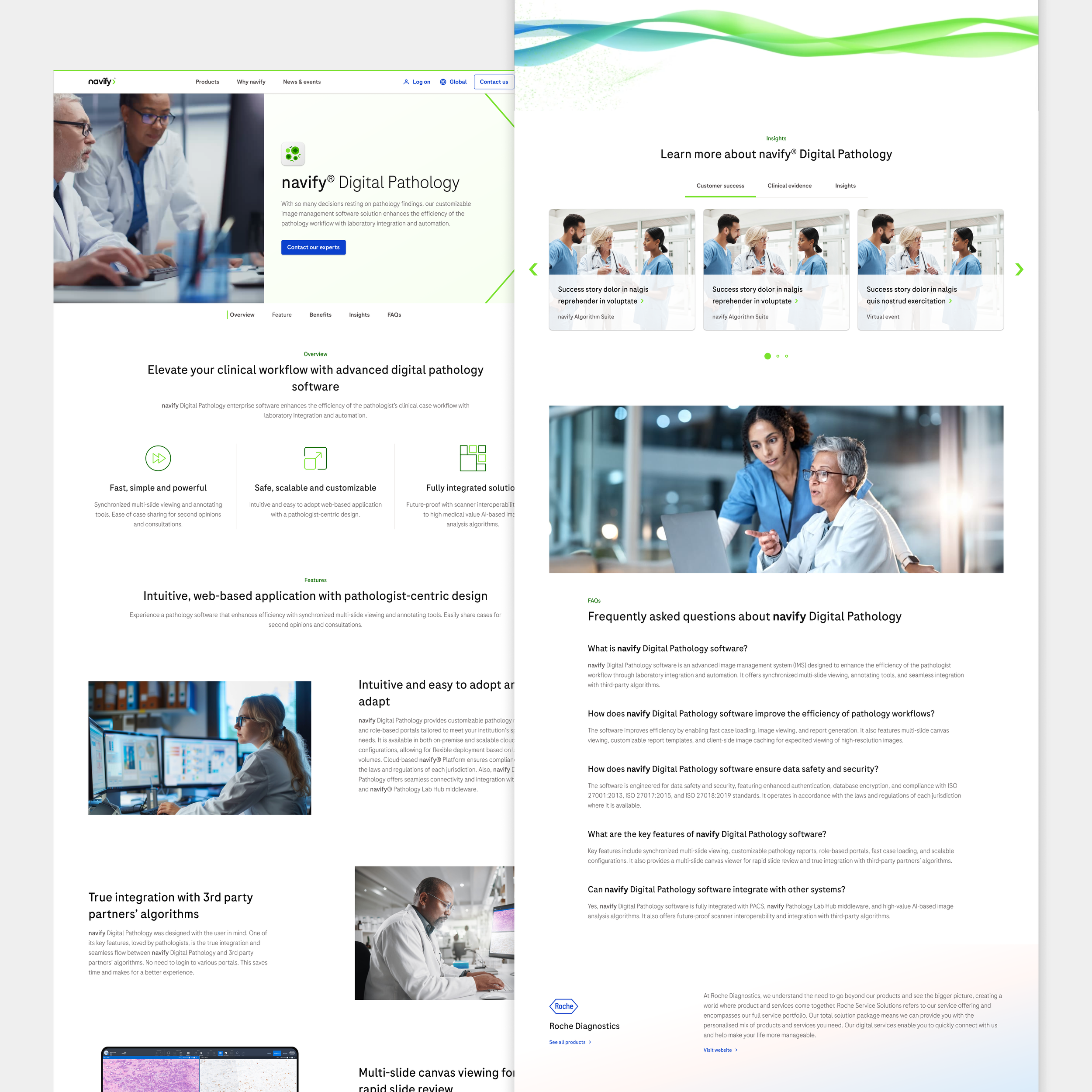
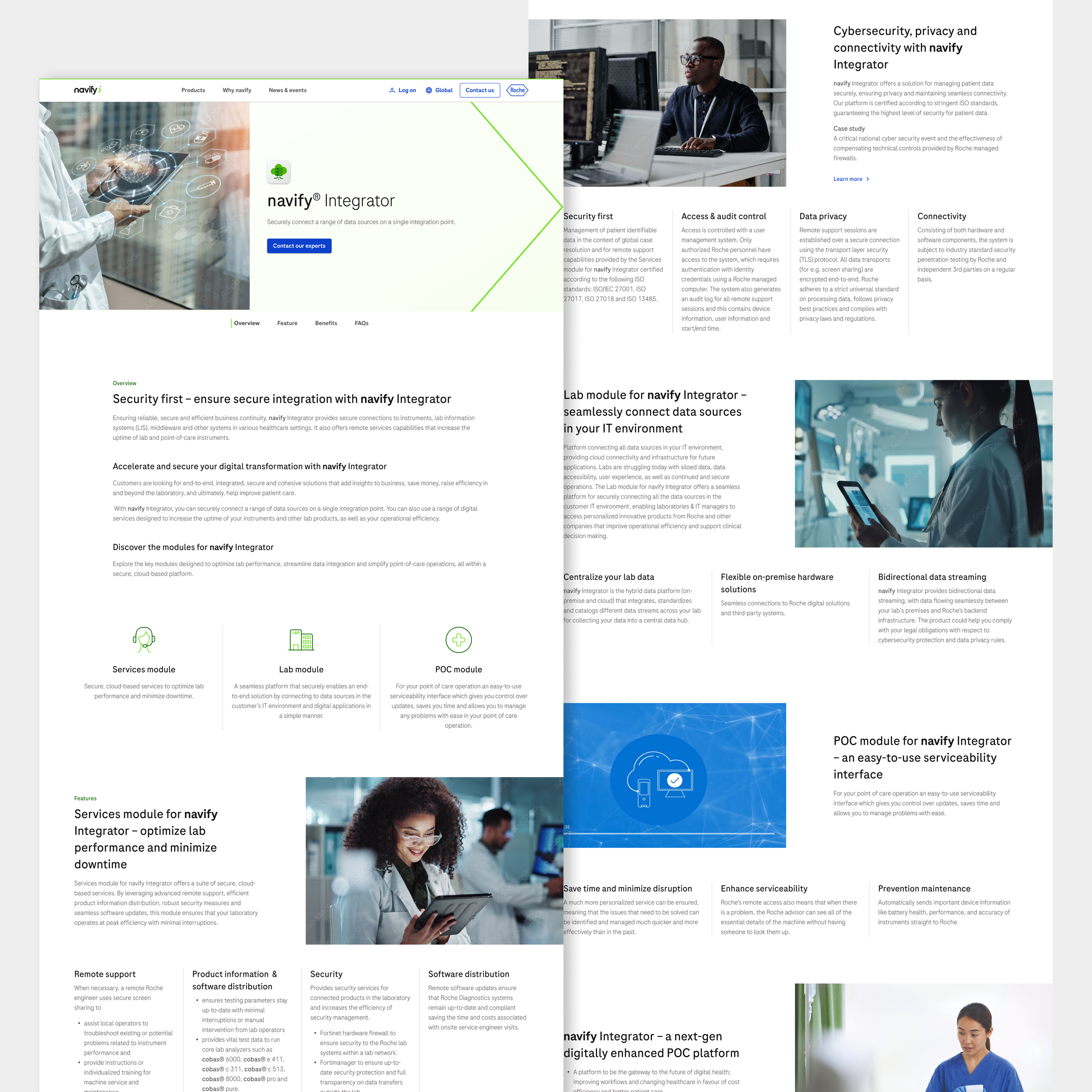
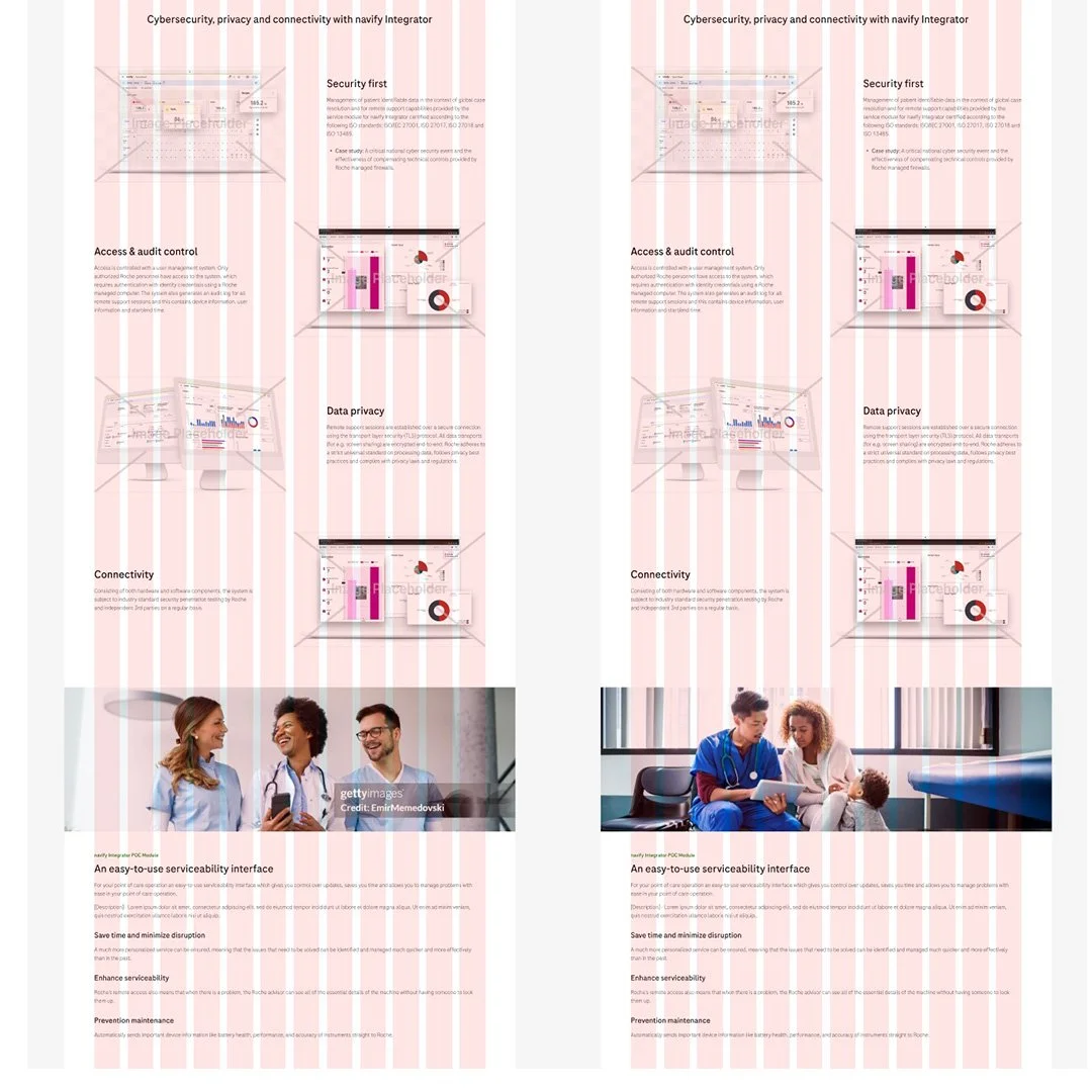
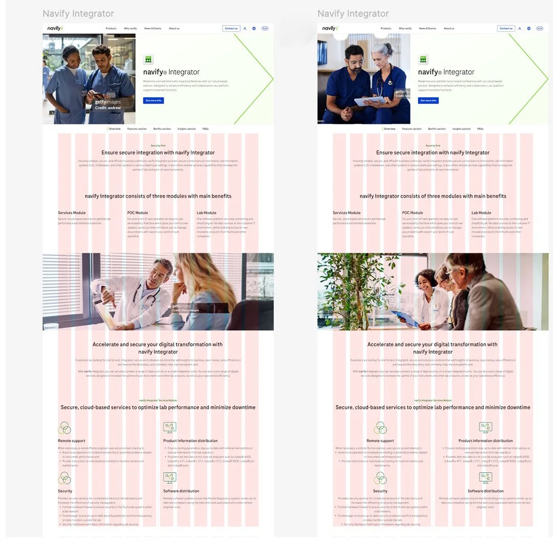
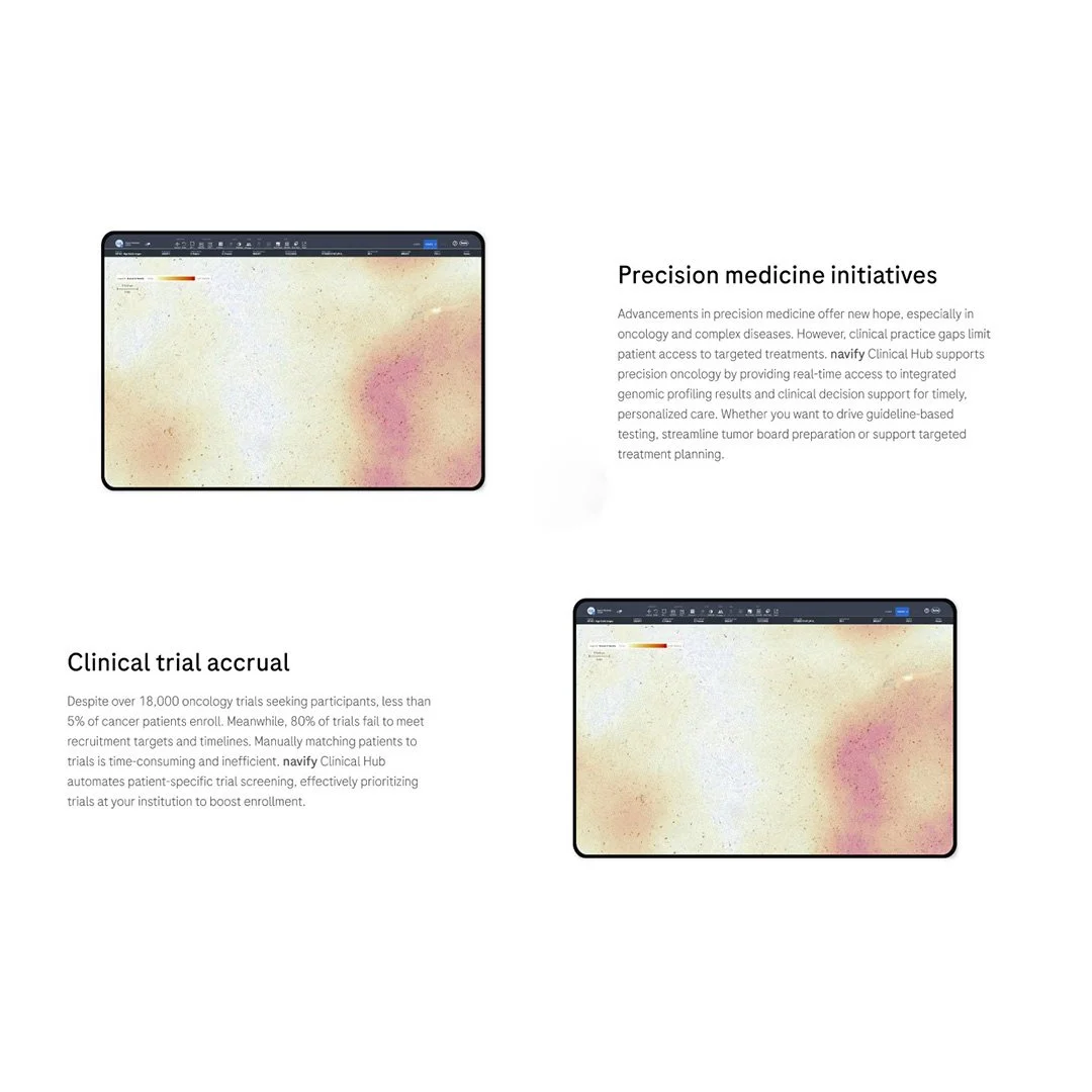
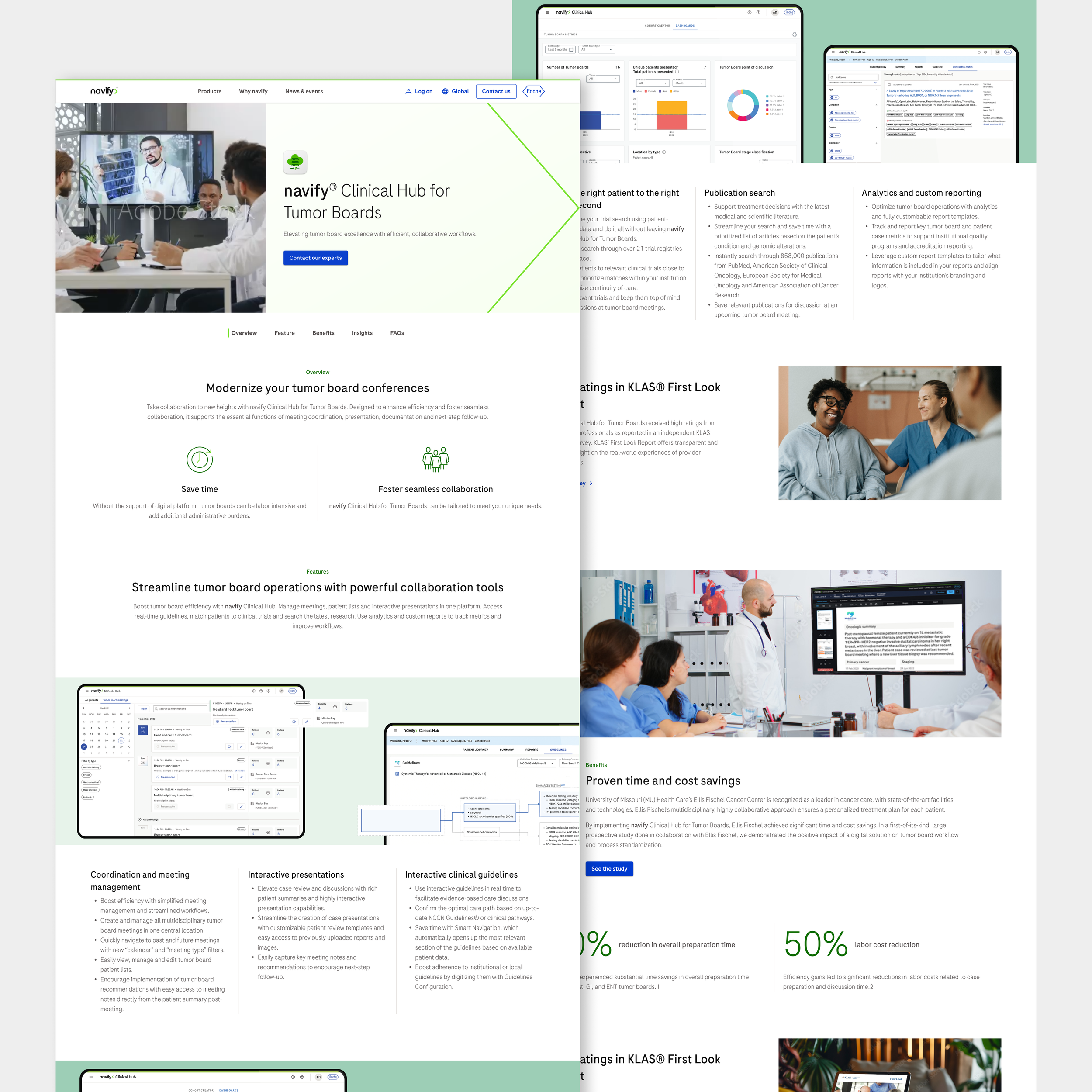
The challenge was to rebuild their pages with a solid content strategy, SEO-optimized copy, and visual alignment with the updated design system.
The OutcomeThe page focuses on clarity and accessibility: a clean form, clear instructions, and a friendly tone that encourages visitors to connect.
Create web pages that balance clarity, credibility, and innovation.
Apply Roche/Navify’s new design system elements consistently.
Research and integrate high-quality imagery aligned with healthcare innovation.
Write SEO-focused copy for better positioning.
-
Analyzed existing pages and competitors.
-
Crafted new text structures with keywords and optimized metadata.
-
Implemented typography, color, and UI patterns from the new DS.
-
Selected and adapted visuals aligned with Navify’s brand.
-
Built final pages in Figma and delivered for live deployment.

The ConceptThe design aligns visually with the rest of the portfolio, ensuring a consistent experience.
Fully redesigned pages with improved readability and SEO.
Consistent alignment with Navify’s evolving design system.
Stronger brand storytelling through visuals and copy.
Improved online visibility through keyword strategy.


My Design Philosophy