
The ChallengeHow do you create a brand that symbolizes connection, fluidity, and balance in a single shape?
The challenge was to build a visual identity that represents both timeless unity and the constant motion of collaboration - an emblem that feels simple, yet carries depth.
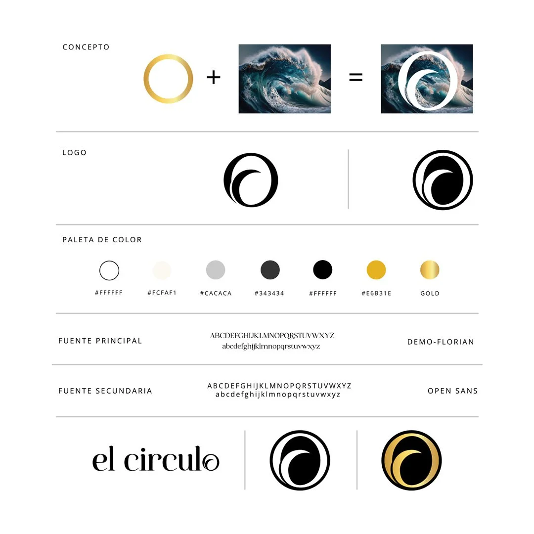
The OutcomeAt the heart of the identity is the circle: a universal shape that has no beginning or end, symbolizing eternity, unity, and harmony.
When paired with the wave, it gains movement and energy, evoking the cycles of connection, the power of collaboration, and the rhythm of constant growth.
Together, circle + wave = El Círculo, a visual metaphor for a community in motion.
-
Built on the golden ratio, balancing elegance with organic flow.
-
Black & white (clarity and timelessness), gold (value and prestige), gray tones (balance and neutrality).
-
Demo-Florian (sophistication and character) + Open Sans (modern clarity and accessibility).
-
Adaptable marks for different contexts, ensuring both versatility and consistency.
The ConceptThe result is a brand that feels alive: minimal yet powerful, timeless yet dynamic.
El Círculo becomes more than a logo, it’s a symbol of collaboration, community, and fluidity, where connections never break, only transform.


My Design Philosophy