
The ChallengeBetMines is a football betting app available on iOS and Android.
The challenge was to redesign their logo and visual identity in a way that feels modern, trustworthy, and adaptable across digital platforms.
The OutcomeThe new design centers around the diamond as a symbol of value, precision, and clarity, which are key elements for sports betting.
The redesigned identity builds a strong and modern presence for BetMines. By using the diamond as the core element, the brand communicates reliability and energy across every touchpoint: app, web, and social media. This consistency ensures recognition and trust while keeping the visual language fresh and engaging.
-
Clean typography inside the diamond shape, with a fresh green gradient to evoke energy and trust.
-
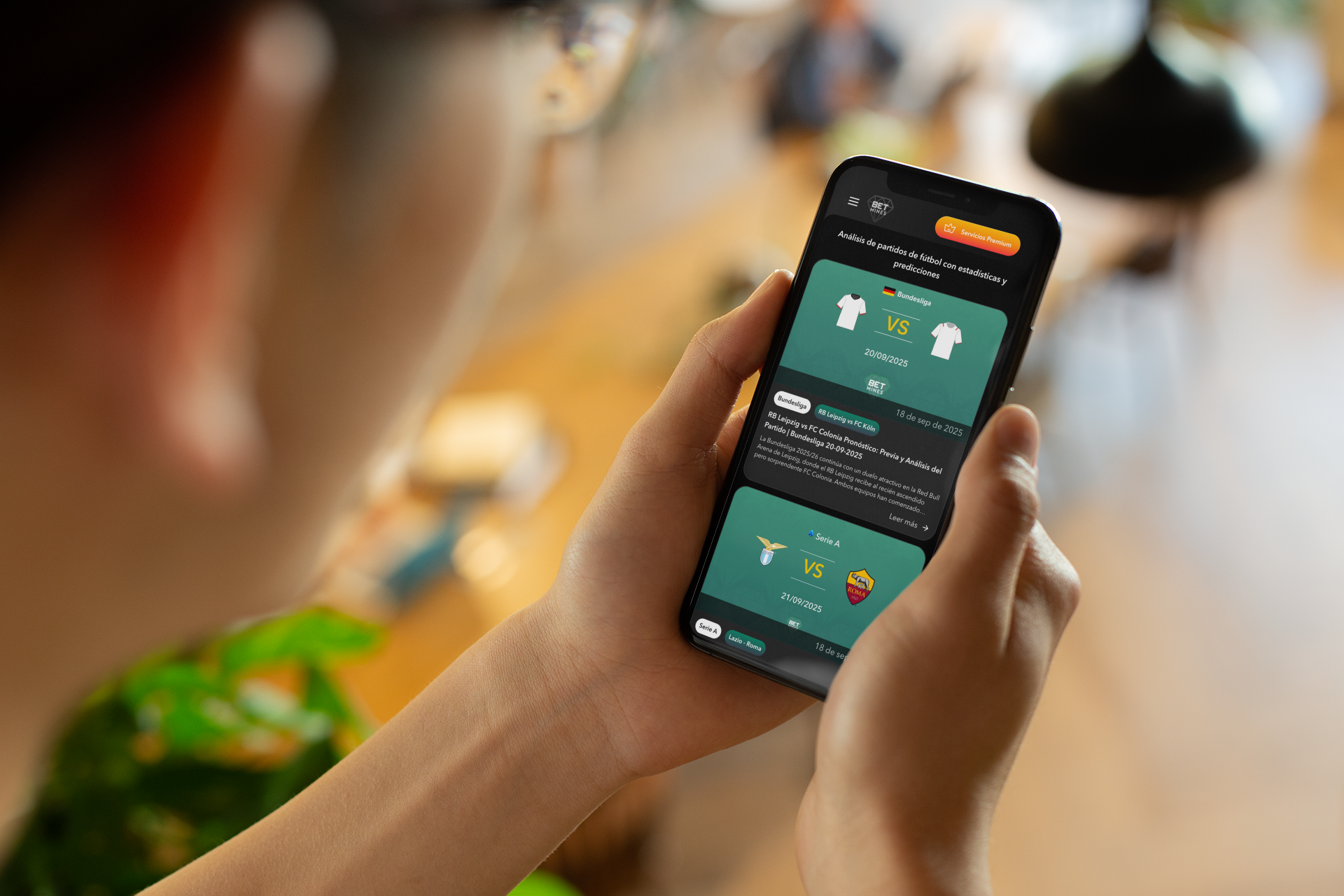
Mockups adapted to web, mobile, and social media to showcase how the new identity strengthens brand recognition.
-
From the app interface to promotional visuals, the diamond works as a flexible and recognizable element.

The ConceptThe redesign gave BetMines a sharper, more professional identity while maintaining a playful energy.
It works seamlessly on their website, mobile apps, and marketing channels, reinforcing their brand presence in a competitive space.


My Design Philosophy